 画像を使用することなくHTMLとCSSだけでデザインした見出しのデザインサンプルを20パターン紹介いたします。できるだけ特性の違うデザインに仕上がるように工夫しております。これから紹介する様々なデザインサンプルを組み合わせれば、また新たな面白い見出しを作ることも可能かと思いますので、カスタマイズも楽しんでみてください。
一部ブラウザで表示できないデザインもあるかと思いますが、その場合はベンダープレフィックスを、各自で追加してください。
このページでは「見出しデザイン」のプレビューに画像を使用していますが、実際の表示は以下デモページで確認することができます。
DEMOページ
手書き風の見出しデザイン[01]
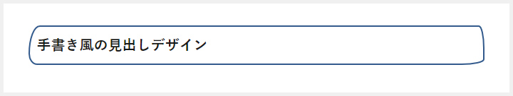 このデザインのポイントは「border-radius」を使い、楕円の横の半径と縦の半径を別々の値に指定している点です。「/」の左側が横の半径となっていて、順番は左上を基準に時計回りです。そして「/」の右側が縦の半径となっていて、順番は先ほどと同様に左上を基準に時計回りです。値をばらばらにすることで、手書きっぽい雰囲気に仕上がります。
<h2>手書き風の見出しデザイン</h2>
h2{
	padding:10px;
	font-size:20px;
	border:2px solid #325A8C;
	border-radius: 20px 10px 40px 15px/50px 40px 10px 20px;
}
サブタイトルを上部に表示する見出しデザイン[02]
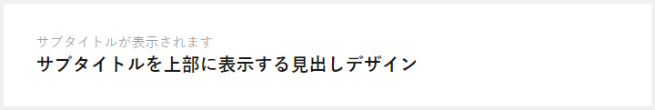 このデザインのポイントは「content: attr(title);」を使い、「h2のtitle属性」の値を表示している点です(contentに直接サブタイトルを記入してしまうと、流用しずらくなるためです)。
<h2 title="サブタイトルが表示されます">サブタイトルを上部に表示する見出しデザイン</h2>
h2{
	position: relative;
	padding-top: 20px;
	font-size: 20px;
}
h2::before{
	position: absolute;
	content: attr(title);
	top:0;
	font-size: 15px;
	font-weight:normal;
	color:#999;
}
内側にシャドウを入れた見出しデザイン[03]
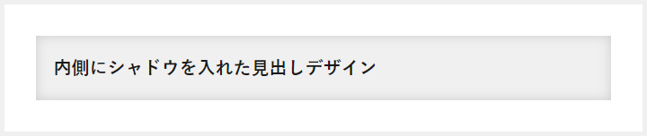 このデザインのポイントは「box-shadow: inset」を使うことで、シャドウをボックスの内側に表示している点です。ここではすべてCSSで対応するために画像を使っていませんが、背景を画像にしたり、シャドウのカラーを変更することで、様々なアレンジが可能となります。
<h2>内側にシャドウを入れた見出しデザイン</h2>
h2{
	padding: 20px;
	font-size:20px;
	background: #F0F0F0;
	box-shadow: 0 0 20px rgba(0, 0, 0, 0.15) inset;
}
リボン風の見出しデザイン[04]
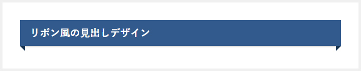 このデザインのポイントは「before after」でベースカラーよりも濃い色の三角形を作ることで、立体感を作り出している点です。h2の中にspanを入れて、点線を上下に表示すれば、もう少しかわいいリボン風見出しになると思います。
<h2>リボン風の見出しデザイン</h2>
h2{
	position: relative;
	padding:10px 20px;
	font-size:20px;
	color:#FFF;
	background: #325A8C;
	box-shadow:0 1px 3px rgba(0,0,0,0.25);
}
h2::before,
h2::after{
	content: "";
	position: absolute;
	top: 100%;
	height: 0;
	width: 0;
	border: 5px solid transparent;
	border-top: 5px solid #1A3654;
}
h2::before{
	right: 0;
	border-left: 5px solid #1A3654;
}
h2::after{
	left: 0;
	border-right: 5px solid #1A3654;
}
すごくリボン風の見出しデザイン[05]
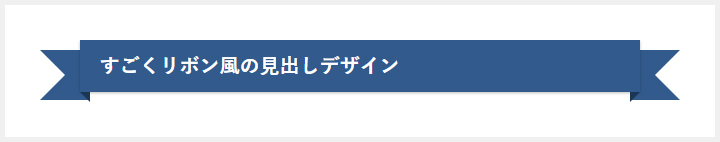 このデザインのポイントは「before after」で「border-right-color: transparent;」と「border-left-color: transparent;」を指定することで、ボーダーの一部分だけ透明にしてリボンを表現している点です。
<h2><span>すごくリボン風の見出しデザイン</span></h2>
h2{
	position: relative;
	padding:10px 20px;
	font-size:20px;
	color:#FFF;
	width: calc(100% - 80px);
	box-sizing: border-box;
	margin-left: 40px;
	background: #325A8C;
	box-shadow:0 1px 3px rgba(0,0,0,0.25);
}
h2:before,
h2:after{
	content: "";
	position: absolute;
	top:10px;
	height: 0;
	width: 0;
	border: 25px solid #325A8C;
	z-index:-1;
}
h2:before{
	right: -40px;
	border-right-color: transparent;
}
h2:after{
	left: -40px;
	border-left-color: transparent;
}
h2 span{
	display:block;
}
h2 span:before,
h2 span:after{
	content: "";
	position: absolute;
	top: 100%;
	height: 0;
	width: 0;
	border: 5px solid transparent;
	border-top: 5px solid #1A3654;
}
h2 span:before{
	right: 0;
	border-left: 5px solid #1A3654;
}
h2 span:after{
	left: 0;
	border-right: 5px solid #1A3654;
}
サブタイトルを枠の上に表示する見出しデザイン[06]
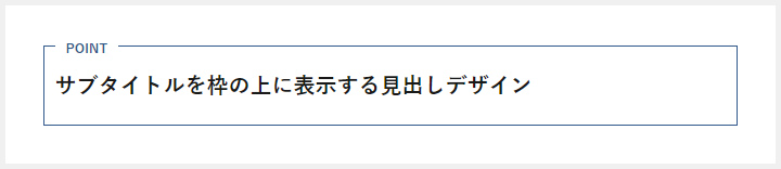 このデザインのポイントは「after」に「background: #fff;」を指定することで、外枠のボーダーを一部分だけ消している点です。ここでは左寄せのデザインを紹介していますが、テキストを中央寄せしても雰囲気が出る見出しデザインになっています。
<h2>サブタイトルを枠の上に表示する見出しデザイン</h2>
h2{
	position:relative;
	padding:20px 10px;
	font-size:20px;
	border:1px solid #325A8C;
}
h2::after{
	content: "POINT";
	position: absolute;
	top: -8px;
	left: 10px;
	background: #fff;
	font-size: 12px;
	color: #325A8C;
	padding: 0 10px;
}
マーカー風の見出しデザイン[07]
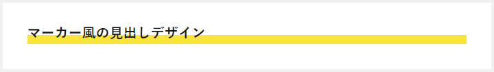 このデザインのポイントは「background」に「linear-gradient(transparent 60%, #FAE438 60%)」を指定している点です。上から60%までは透明で、その先は黄色にすることで、マーカー風デザインを再現しています。
<h2>マーカー風の見出しデザイン</h2>
h2{
	font-size:20px;
	background: linear-gradient(transparent 60%, #FAE438 60%);
}
消えていくボーダーを表示する見出しデザイン[08]
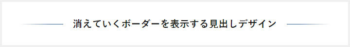 このデザインのポイントは「span」に「display: inline-block;」を指定してグラデーションボーダーを消すように要素を乗っけている点です。背景が白じゃないときは、「span」の背景色も白から変更してください。
<h2><span>消えていくボーダーを表示する見出しデザイン</span></h2>
h2{
	position: relative;
	text-align: center;
	font-size:20px;
}
h2::before{
	position: absolute;
	top: 50%;
	z-index: 1;
	content: "";
	display: block;
	width: 100%;
	height: 1px;
	background: #000;
	background: linear-gradient(-45deg, transparent, #325A8C 10%, #325A8C 90%, transparent);
}
h2 span{
	position: relative;
	z-index: 2;
	display: inline-block;
	padding: 0 20px;
	background-color: #fff;
	text-align: left;
}
外にはみ出すボーダーの見出しデザイン[09]
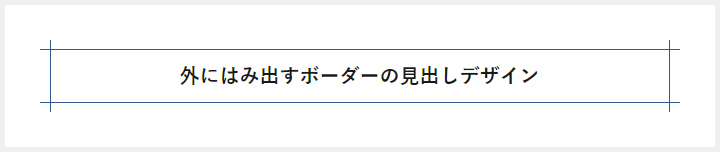 このデザインのポイントは「before after」に指定している「height: calc(100% + 20px);」です。「h2」の高さよりも20px分多く高さを持たせることで、ボーダーがはみ出しているようにデザインすることができています。
<h2>外にはみ出すボーダーの見出しデザイン</h2>
h2{
	position: relative;
	padding: 10px 20px;
	font-size:20px;
	text-align:center;
	border-top: solid 1px #325A8C;
	border-bottom: solid 1px #325A8C;
}
h2::before,
h2::after{
	content: '';
	position: absolute;
	top: -10px;
	width: 1px;
	height: calc(100% + 20px);
	background-color: #325A8C;
}
h2::before{left: 10px;}
h2::after{right: 10px;}
内側にボーダーがある見出しデザイン[10]
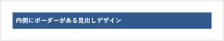 このデザインのポイントは「h2」に指定している「box-shadow:inset 1px 1px 0」を指定している点です 横の距離と縦の距離を1pxに指定して、ぼかしの大きさを0にすることでボックスの内側にボーダー風の影を表示しています。
<h2>内側にボーダーがある見出しデザイン</h2>
h2{
	padding:10px;
	font-size:20px;
	border:1px solid #325A8C;
	background: #325A8C;
	color:#FFF;
	box-shadow:inset 1px 1px 0 rgba(255,255,255,0.5);
}
文字にボーダーを加えた見出しデザイン[11]
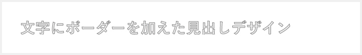 このデザインのポイントは「text」要素に「stroke: #7F7F7F;」と「stroke-width: 1px;」を指定して、文字の外側に1pxのボーダーを表現している点です。SVGを巧みに扱えるようになれば、もっと複雑でギミックの効いたデザインを表現することが可能です。
<h2>
  <svg height="30px" width="100%">
    <text y="28px">文字にボーダーを加えた見出しデザイン</text>
  </svg>
</h2>
h2{
	font-size:20px;
}
h2 text{
	stroke: #7F7F7F;
	stroke-width: 1px;
	fill: #efefef;
	font-size: 30px;
}
右側にサブタイトルを表示する見出しデザイン[12]
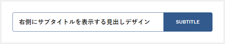 このデザインのポイントはサブタイトルを上部に表示する見出しデザインと同様に、「content: attr(title);」を使い、「h2のtitle属性」の値を表示している点です。今回は右側にサブタイトルを表示していますが、「before」の「right: 0;」を「left: 0;」に変更することで左側に指定することも可能です(その場合floatを指定したほうが簡単です)。
<h2 title="SUBTITLE">右側にサブタイトルを表示する見出しデザイン</h2>
h2{
	position: relative;
	height: 60px;
	line-height: 60px;
	padding: 0 0 0 20px;
	font-size:20px;
	border: 1px solid #325A8C;
	border-radius: 6px;
}
h2::before{
	content: attr(title);
	position: absolute;
	right: 0;
	top: 0;
	padding:0 40px;
	font-size:15px;
	background: #325A8C;
	color: #fff;
}
文字の下だけボーダーカラーを変更する見出しデザイン[13]
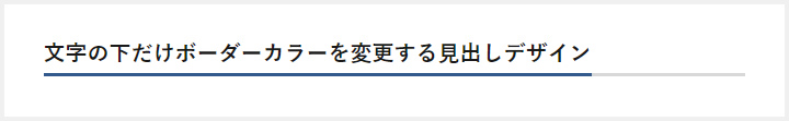 このデザインのポイントは「overflow: hidden;」に「overflow: hidden;」を指定することで、本当ははみ出してしまっているborderを、はみ出していないように見せている点です。
<h2>文字の下だけボーダーカラーを変更する見出しデザイン</h2>
h2{
	position: relative;
	overflow: hidden;
	padding-bottom: 5px;
	font-size:20px;
}
h2::before,
h2::after{
	content: "";
	position: absolute;
	bottom: 0;
}
h2:before{
	border-bottom: 3px solid #325A8C;
	width: 100%;
}
h2:after{
	border-bottom: 3px solid #D8D8D8;
	width: 100%;
}
様々な要素を組み合わせた見出しデザイン[14]
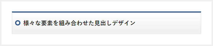 このデザインのポイントは「h2」に指定した「background: linear-gradient(#ffffff 0%, #EFEFEF 100%);」です。弱めのグラデーションを指定することで、立体感のあるデザインに仕上がっています。またbottom部分にも白い線がうっすらと入っている点もポイントです。
<h2>様々な要素を組み合わせた見出しデザイン</h2>
h2{
	position: relative;
	padding: 20px 20px 20px 38px;
	font-size:20px;
	border: 1px solid #D8D8D8;
	border-top: 4px solid #325A8C;
	background: linear-gradient(#ffffff 0%, #EFEFEF 100%);
	box-shadow: 0 -1px 0 rgba(255, 255, 255, 1) inset;
}
h2::after{
	content: "";
	position: absolute;
	top: 50%;
	left: 10px;
	margin-top: -10px;
	width: 18px;
	height: 18px;
	border: 4px solid #325A8C;
	border-radius: 100%;
	box-sizing:border-box;
}
グラデーションと内線を加えた見出しデザイン[15]
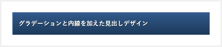 このデザインのポイントはボックスの内側に表現した白い線と、優しいグラデーション、そしてテキストシャドウです。立体感のある見出しデザインになっているかと思います。
<h2>グラデーションと内線を加えた見出しデザイン</h2>
h2{
	padding: 20px;
	font-size:20px;
	color: #fff;
	text-shadow: 1px 1px 1px rgba(0,0,0,0.75);
	background: linear-gradient(#325A8C 0%, #1C3959 100%);
	border:1px solid #325A8C;
	box-shadow:inset 1px 1px 0 rgba(255,255,255,0.25);
}
マーク付きの見出しデザイン[16]
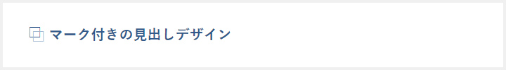 このデザインのポイントは「before after」に指定した「content: “□”;」です。□を◎☆などに指定すれば、別のマークの見出しにすることもできます。また「before after」にそれぞれ別々の要素を指定しても面白いかもしれません。
<h2>マーク付きの見出しデザイン</h2>
h2 {
	position: relative;
	padding-left: 30px;
	font-size:20px;
	color: #325A8C;
}
h2::before,
h2::after{
	content: "□";
	position: absolute;
}
h2::before{
	left:0;
	top:-3px;
}
h2::after{
	left: 5px;
	top: 3px;
	color: #A1B8D1;
}
ボックス風の見出しデザイン[17]
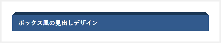 このデザインのポイントは「before」に指定した「border-bottom-color: #1A3654;」です。bottom以外のボーダーカラーを透明に指定しているため、台形のボーダーを再現できています。
<h2>ボックス風の見出しデザイン</h2>
h2{
	position: relative;
	padding: 10px 20px;
	font-size:20px;
	background: #325A8C;
	color: #ffffff;
}
h2::before{
	content: "";
	position: absolute;
	top: -20px;
	left: 0;
	width: calc(100% - 20px);
	height: 0;
	border: solid 10px transparent;
	border-bottom-color: #1A3654;
}
最初の文字だけ加工する見出しデザイン[18]
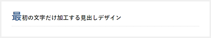 このデザインのポイントは「h2」に「first-letter」疑似要素を指定し、フォントカラーとサイズを変更している点です。
<h2>最初の文字だけ加工する見出しデザイン</h2>
h2{
	position: relative;
	padding:0 0 5px 0;
	font-size:20px;
	border-bottom:#BFBFBF dotted 1px;
}
h2:first-letter{
	font-size:35px;
	color:#325A8C;
}
グラデーションボーダーの見出しデザイン[19]
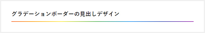 このデザインのポイントは「h2」に指定した虹色の背景色の上に背景白の「span」を組み合わせることで、虹色のボーダーを再現している点です。ボーダーにグラデーションを指定することができないので、無理やり形にしています。
<h2><span>グラデーションボーダーの見出しデザイン</span></h2>
h2{
	padding-bottom:2px;
	font-size:20px;
	background: linear-gradient(135deg, #f44336 0%,#ff9800 17%,#ffeb3b 32%,#4caf50 50%,#2196f3 67%,#3f51b5 84%,#9c27b0 100%);
}
h2 span{
	display: block;
	background: #fff;
	padding-bottom:10px;
}
グラデーションテキストの見出しデザイン[20]
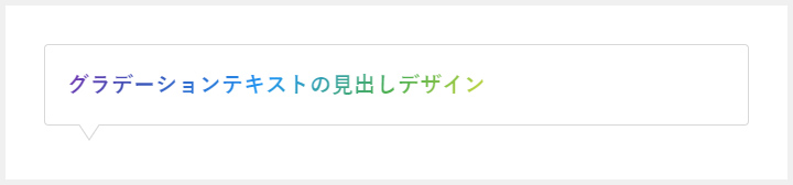 このデザインのポイントは「h2」に指定した「-webkit-background-clip: text;」です。この指定でテキストの部分にのみ背景を指定することができます。今回はグラデーションにしてますが、画像を指定することも可能です。「before after」を削除すれば吹き出しデザインを解除できます。
<h2>グラデーションテキストの見出しデザイン</h2>
h2{
	position: relative;
	padding:20px;
	font-size:20px;
	background: -webkit-linear-gradient(135deg, #f44336 0%,#ff9800 17%,#ffeb3b 32%,#4caf50 50%,#2196f3 67%,#3f51b5 84%,#9c27b0 100%);
	-webkit-text-fill-color: transparent;
	-webkit-background-clip: text;
	border: 1px solid #D8D8D8;
	border-radius: 4px;
}
h2::before,
h2::after{
	position: absolute;
	top: 100%;
	left: 30px;
	content: "";
	height: 0;
	width: 0;
	border: 10px solid transparent;
}
h2::before{
	border-top: 15px solid #D8D8D8;
}
h2::after{
	margin-top: -2px;
	border-top: 15px solid #ffffff;
}